In preparation for launching the aggregated watch experience, we aim to explore promo teaser designs and information communication strategies to inform and enhance our overall design.
Competitor Audit
The following competitors were evaluated during the competitor audit:
Apple TV+
Disney+
Netflix
Prime Video
Process
Research Plan: Develop qualitative methodology focused on:
Understanding user preferences by comparing the Crave website with four leading competitors.
Gaining insights into user perceptions and thresholds concerning the amount of information presented in the banner.
Identifying strategies to enhance flow, clarity, and aesthetic appeal.
Method:
Competitive Audit: Conducted 10 unmoderated interviews to evaluate the promo teasers of four top competitors.
A/B Testing: Performed 10 unmoderated user interviews to compare two prototype variations.
Qualitative Analysis: Analyzed data to assess clarity, aesthetic appeal, and user preferences regarding the simplification of promo teasers.
Competitive Audit
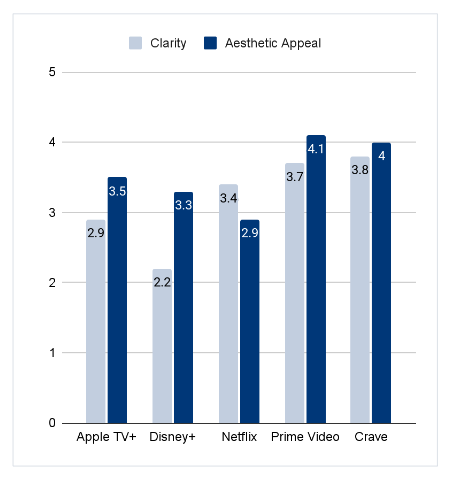
Comparative Analysis: User Preferences
Comparative Analysis: User Rankings
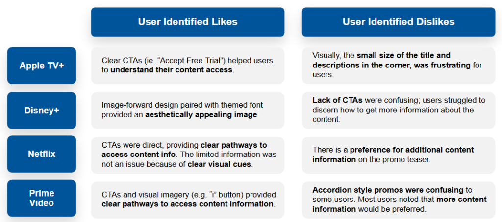
Clarity
Users prefer having as much information as possible on promo teasers
When information is lacking, clear CTAs help to define user flows and actions
Netflix’s “Get Info” button was lauded for its clarity, while Disney+’s lack of information was frustrating and caused confusion
Aesthetic Appeal
Users enjoyed “clean” and “minimalistic” designs
Crave’s ability to balance information communication with clean designs was appreciated
Prime Video’s minimal designs paired with straightforward information communication and visual imagery (e.g. “i” button) was lauded by users
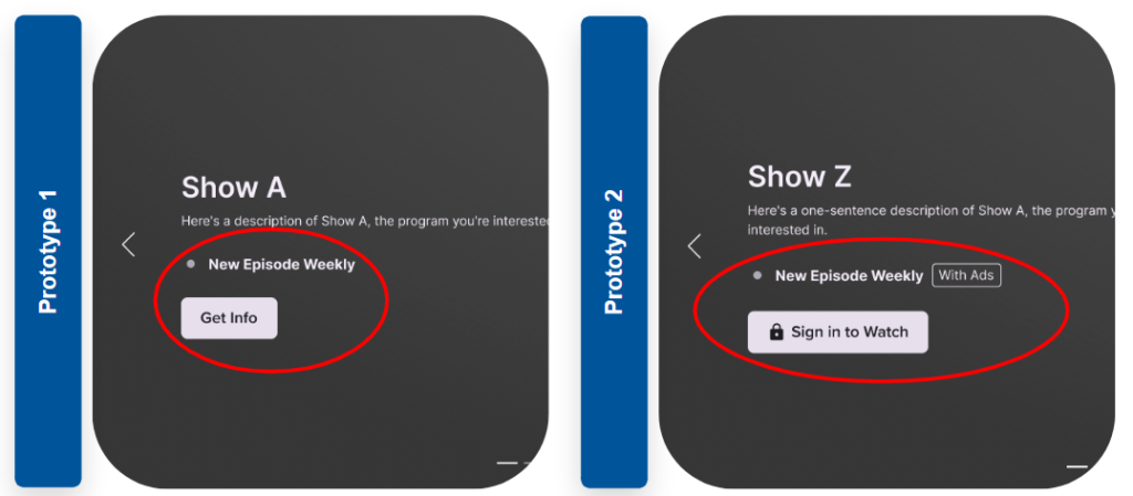
Prototype Analysis
Prototype Mock Ups
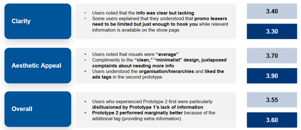
User Preferences
Prototype: Ratings
Key Takeaways
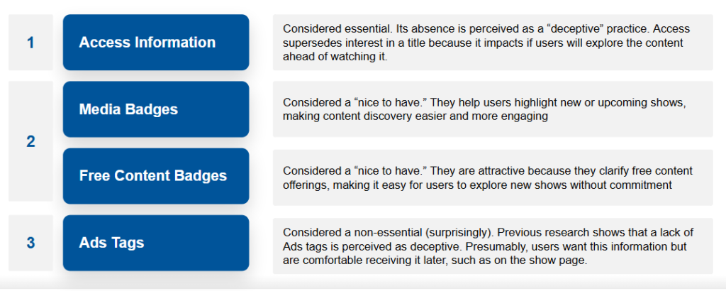
Content Information: Rankings
Users were asked to rank content information that could appear on promo teasers based on how essential they felt it was.
UX Recommendations
Visual Imagery
“More Information” button: clear visual imagery and CTAs help to provide users with straightforward access to detailed information
Promo images and videos: images and videos on promo teasers significantly impact user experience, suggesting the need for more research about potentially integrating video content
Navigation Features
Click anywhere: allowing users to click anywhere on the banner to navigate to the show page is an intuitive action
Removal of play button: play button does not offer any significant advantages for users’ experience
Access Information
Clear access information communication: users are frustrated by unclear access information, particularly if additional actions are required from them after a content start
Clear ads information: clearly label and communicate ads information to set user expectations
Content Information
Overall preference for more information: though counter-objective, users claim to want more information on the promo teasers, suggesting that user experience is enhanced with more provision of information
In simulated research environments, users tend to overstate the importance of certain features and information. Further research to understand what prompts content starts, paired with users’ content information rankings can help to ascertain non-negotiables for the promo teasers.
Cart(0 items)
No products in the cart.
Select the fields to be shown. Others will be hidden. Drag and drop to rearrange the order.